3 generations of the B&O app – which one would you prefer?
Tagged: game
- This topic has 25 replies, 11 voices, and was last updated 10 months, 3 weeks ago by
Millemissen.
- AuthorPosts
- November 19, 2023 at 11:01 am #26300
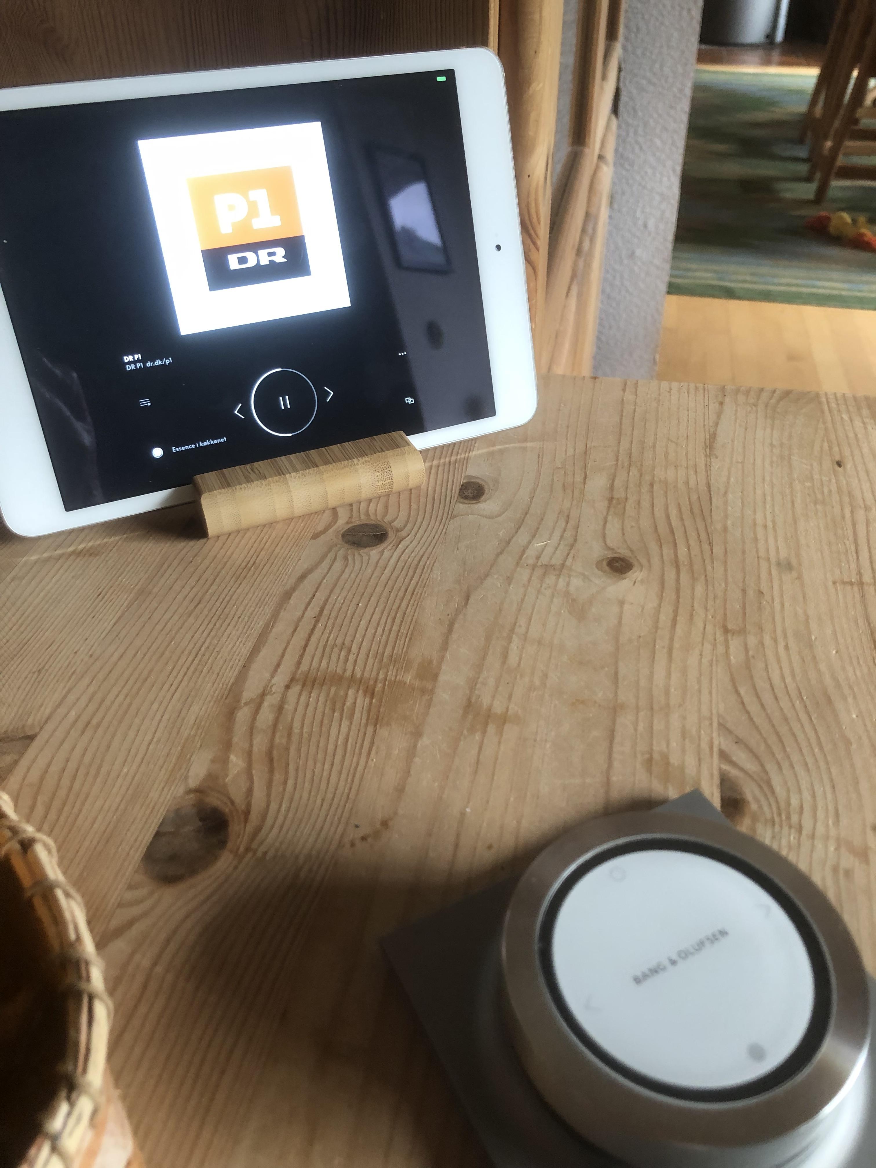
In 3 of my room I have – and have had for a long time – older iPads with the B&O app wall mounted.
I like to see the ‘B&O-things’ especially in the room where you can not see the device (normally you’d hide an Essence or Core).
Apart from the visualization of the device in standby, I also like to see what is going on when playing (radio station logo, cover art and info about the tracks playing etc).I seldom use these iDevices/the app for controlling – some times just for volume control.
They are a display for the respective devices.
I do the controlling with the BeoRemote One/the Essence Remote.There is a setting in the app, that makes it possible to have the iDevices/the app allways on.
So I guess the makers have thought that the users might want us to use this visualization…..or at least offers us the option to.However, the looks of the app, when a device is in standby, has changed with the new version.
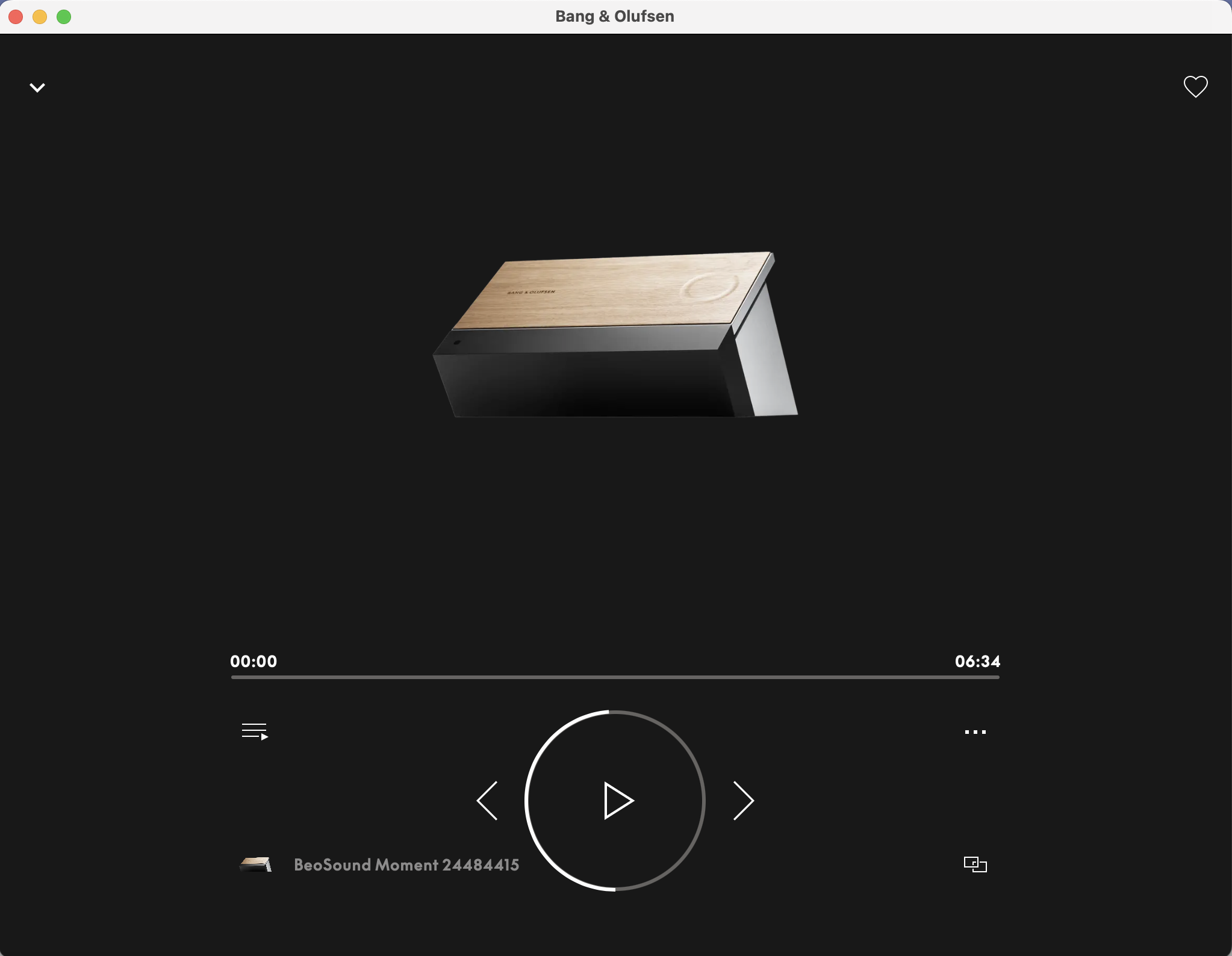
Here are 3 designs:
Which would you prefer?
Or maybe you do not care at all??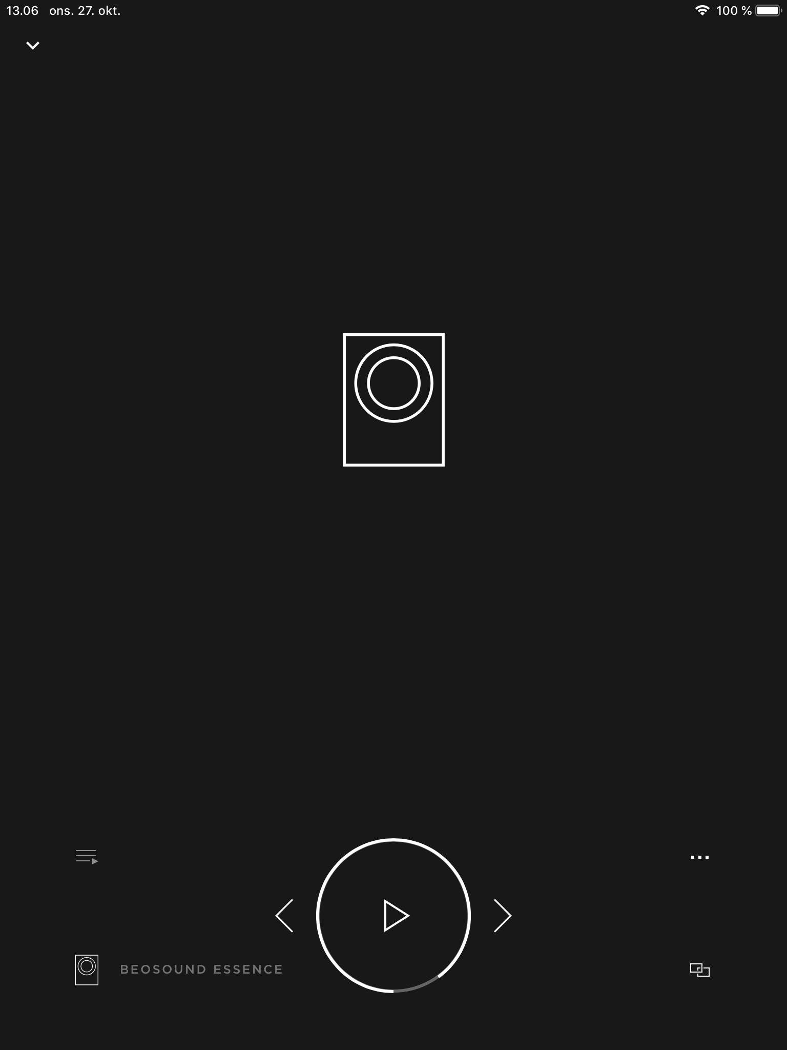
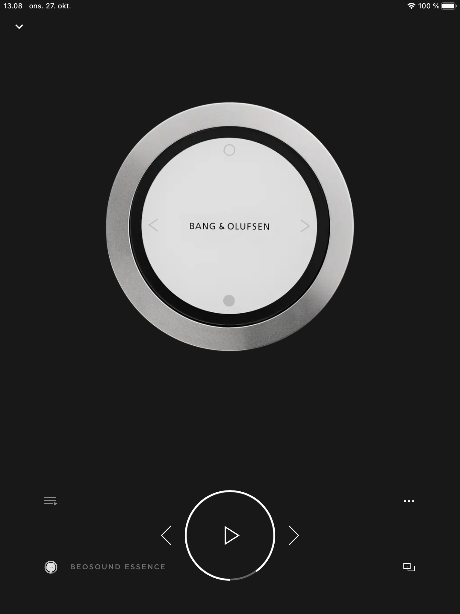
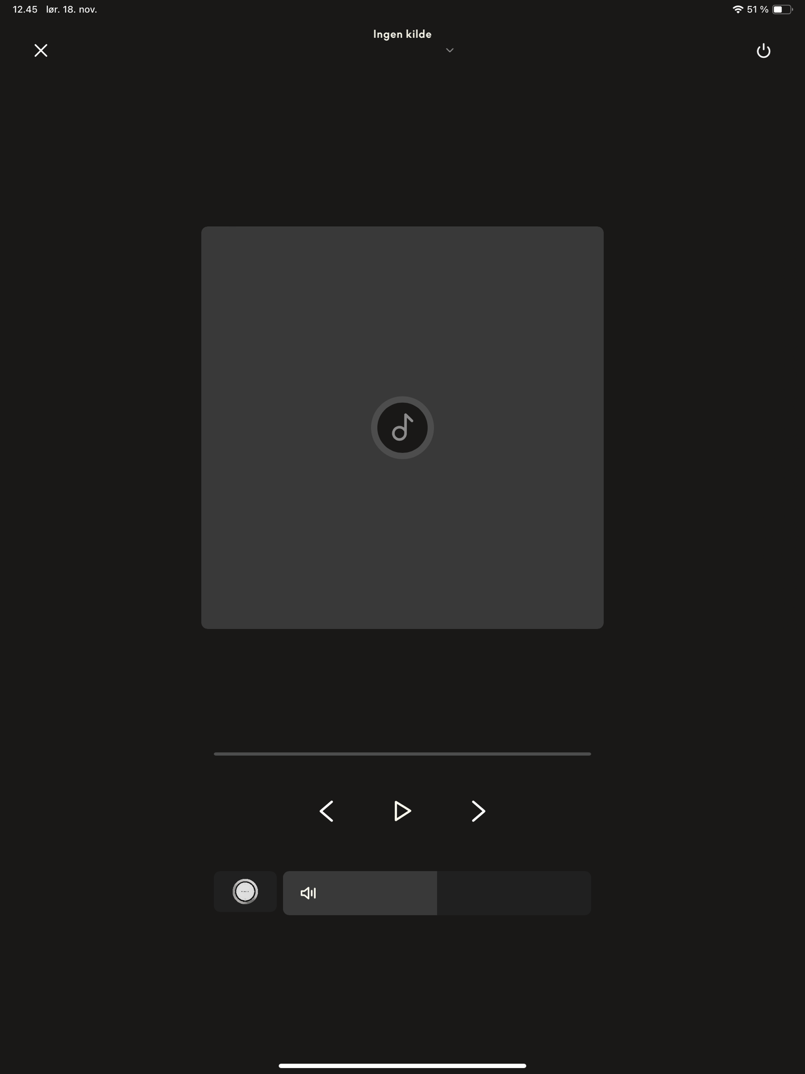
P.S.
I sure know which one I prefer to look at in my rooms/home.MM
November 19, 2023 at 11:39 am #26301MM – you’re not the only one who misses the middle design above ?
November 19, 2023 at 11:53 am #26303I sure know which one I prefer to look at in my rooms/home. MM
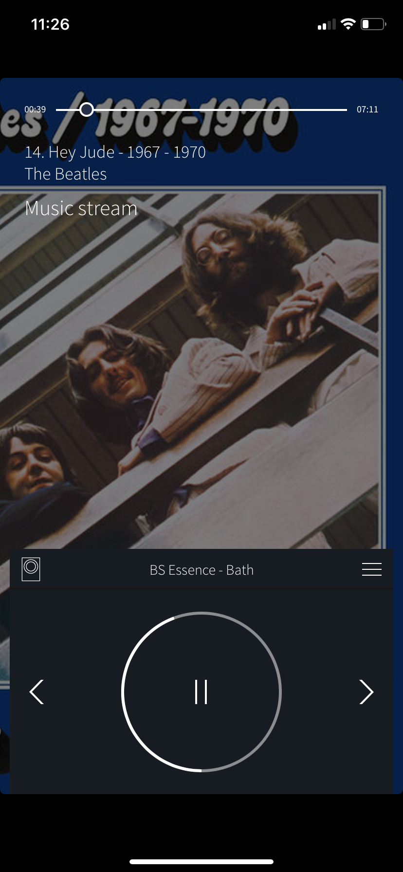
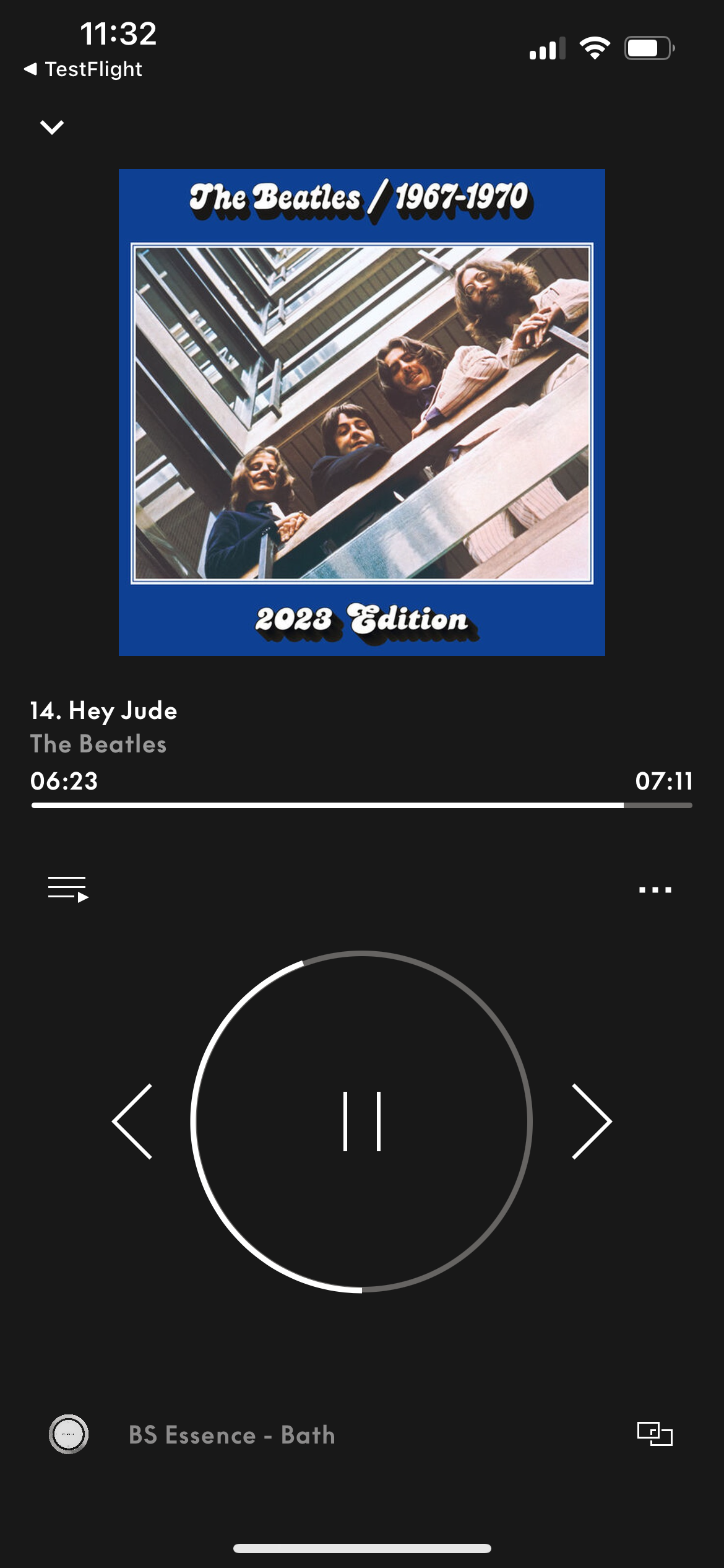
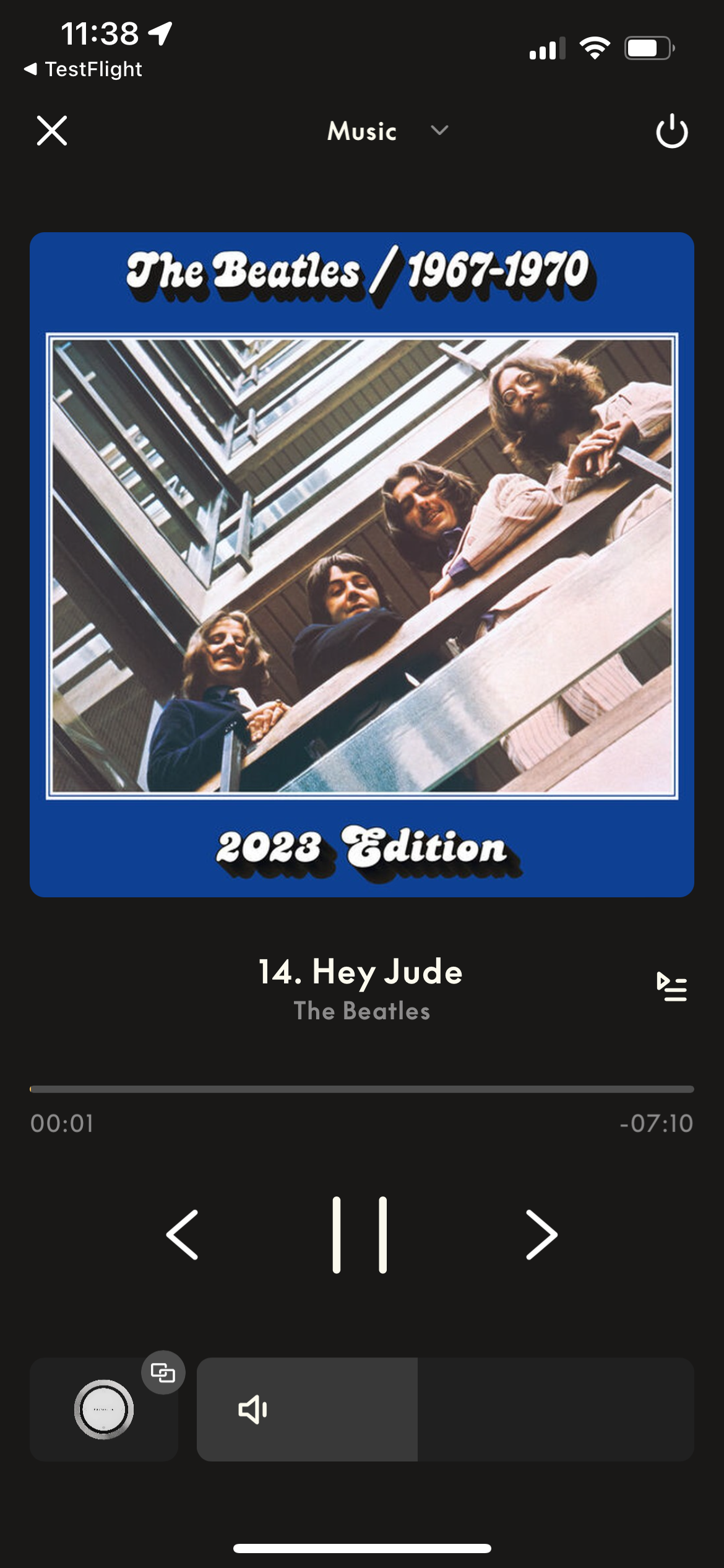
What an immense difference …….. with in my opinion more objective pictures. It shows an evolution in three generations of the B&o app.
To me the latest UI is the easiest to operate……whereas the first is the most complex but very nice even after all these years.November 19, 2023 at 12:36 pm #26305P.S.
No secret….it is not the newest app version that is my favourite ?(When in standby mode) I actually like the first one with the minimalistic graphic design of the Essence (Remote).
If a picture, I would prefer if you could place a picture of my own setup/room there – the picture of the ‘wheely’ is too bulky imo.The only thing, I would miss there, are the 4 dots/the My Buttons.
I fail to understand why they are not a part of the app!
They are present on the BeoRemote One and on the new B&O devices.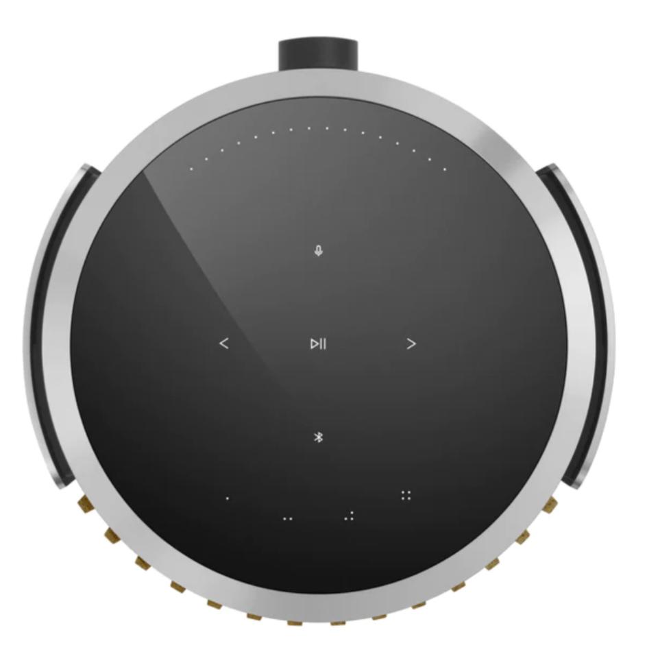

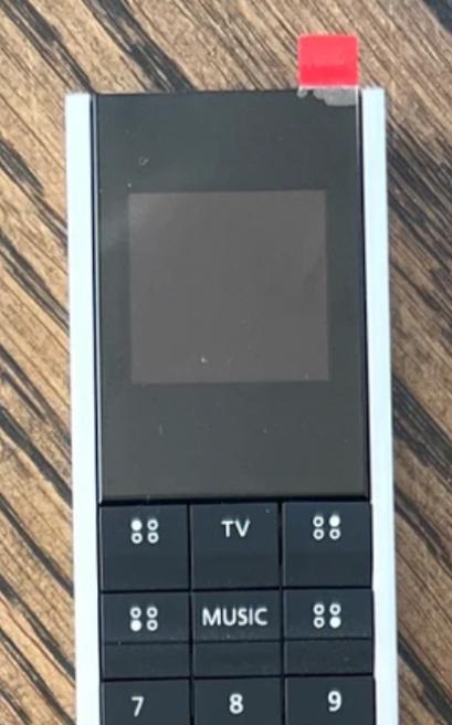
In my opinion all B&O products have to have a consistant and easily recognisable design language….including the app.
Is this the case with the new app version?Just thinking out loud – it would be nice, if the designer of the newer B&O devices/NOTO Design/André Poulheim could comment on this.
But maybe this is just me – maybe the majority of the (newer) B&O don’t give a sh*t about these things ?
MM
November 19, 2023 at 12:58 pm #26308I sure know which one I prefer to look at in my rooms/home. MM
What an immense difference …….. with in my opinion more objective pictures. It shows an evolution in three generations of the B&o app. To me the latest UI is the easiest to operate……whereas the first is the most complex but very nice even after all these years.
I get your point – the second one looks nice when playing.
My ‘problem’ – maybe – is that I hardly ever see the app on my iPhone.
I was talking about an app, that – like mine on iPads – can represent a missing display for the actual devices.I do not use the app much for controlling….and do not carry my iPhone with me, when I am at home.
And even if – I do not agree with you that the latest UI is the best for navigating….it is still too unfinished imo.
I add/remove rooms with my BROnes respectively on the device.
For me the multiroom section in the new app is way too present.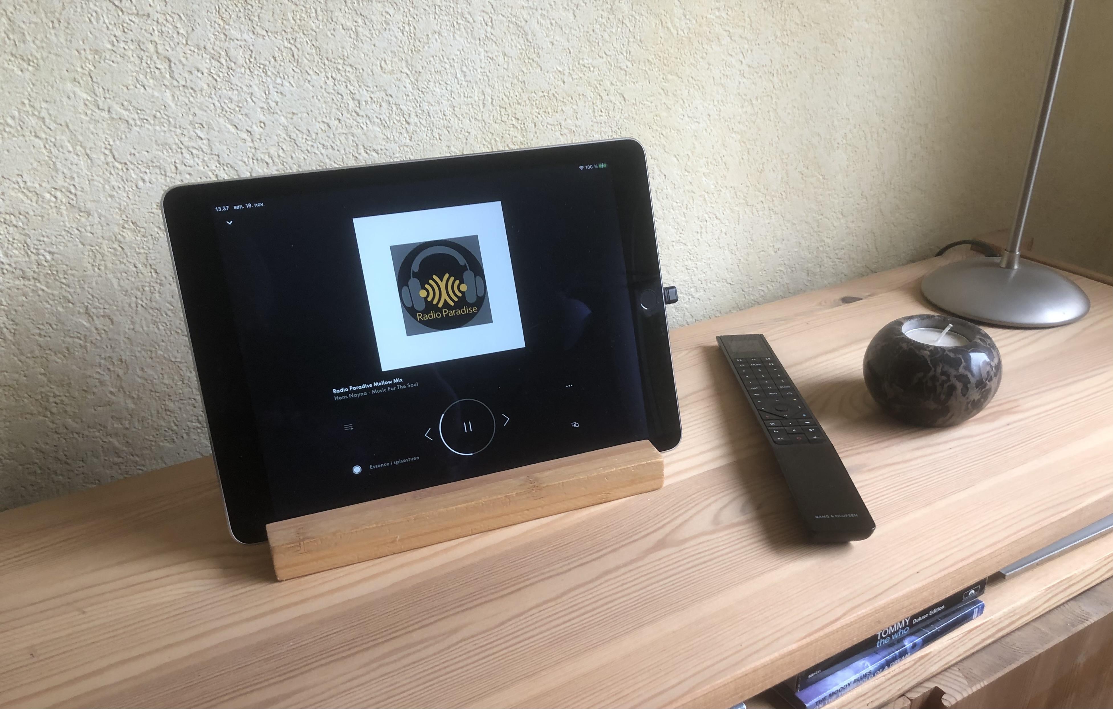
Again – this might be just me and my use case.
Others might carry their phone with them all the time and do not have/use a BROne or the Essence Remote.MM
November 19, 2023 at 1:02 pm #26310You can enter a Feature request – in the App Feature Request thread – in Discord.
Mr.Anderson of the app dev team asked me to set up a section there (its under B&O Engagement), and there is a master list of outstanding feature requests there, for B&O to look at.
While i imagine you have provided your feedback through other means, I only mention it to you as the B&O guys have a specific place on the Discord server where they check in and look at a collated list of feature requests.
Anyway, just a passing thought.
November 19, 2023 at 1:44 pm #26312I sure know which one I prefer to look at in my rooms/home. MM
What an immense difference …….. with in my opinion more objective pictures. It shows an evolution in three generations of the B&o app. To me the latest UI is the easiest to operate……whereas the first is the most complex but very nice even after all these years.
I get your point – the second one looks nice when playing. My ‘problem’ – maybe – is that I hardly ever see the app on my iPhone. I was talking about an app, that – like mine on iPads – can represent a missing display for the actual devices. I do not use the app much for controlling….and do not carry my iPhone with me, when I am at home. And even if – I do not agree with you that the latest UI is the best for navigating….it is still too unfinished imo. I add/remove rooms with my BROnes respectively on the device. For me the multiroom section in the new app is way too present. Again – this might be just me and my use case. Others might carry their phone with them all the time and do not have/use a BROne. MM
Concerning the new iPad interface I do agree with you. The amount of info presented is way to much and the overall chosen colour pallet makes it worse.
Although the multi-room and playlist can be closed, it is annoying that both are opened when the player is selected. Also the previous and next Album covers shown make the iPad experience unpleasant.
The iPad version need for sure some sophistication!
November 19, 2023 at 7:32 pm #26336The second one, of course 🙂
Without taking into account the desastrous evolution of the app since 5.4.
November 19, 2023 at 9:04 pm #26342This is an interesting and important topic, thanks for starting the discussion. In my own system, I have only my trusty, 23-year old Beosound 9000 6-CD player and my Beosound Moment which, for unknown reasons, B&O discontinued shortly after producing it. I listen to music all the time so a smoothly functioning system is very important to me.
Regarding the B&O app, things were working perfectly with v5.3. It took them long enough to get the app to that stage! With the introduction of v5.4 and then 5.5, the app went pear-shaped: what a catastrophe. It doesn‘t work as well as it did; it doesn’t even look as good as previously either.
In fact, today I spent at least two hours wrestling with the app as it did not function properly at all. Eventually, I informed B&O Support who tell me that there is “an app outage and our team is working to get this fix as soon as possible”. Life is too short to have to troubleshoot continual and repeated problems like this, especially given the cost of B&O equipment.
So, obviously, my favourite generation of the app is v5.3 which I have reinstalled on all of my devices: iPhone, iPad and MacBook Air. Although they finally restored the music play queue in v5.5.1, it doesn‘t allow me to select a track and go to the artist … as it used to. I don’t even have the option to delete the entire play queue any longer.
p.s. I am interested in the App Feature Request thread in Discord mentioned by MM. How do I access that?
 November 19, 2023 at 9:17 pm #26345
I forgot to mention that I mostly use my MacBook Air as the B&O App interface, even though the app isn’t really designed for use on a Mac. I wish it was; My MacBook has basically replaced my iPad as device of choice. I use my iPhone B&O app when I’m upstairs in bed.
November 19, 2023 at 10:13 pm #26346p.s. I am interested in the App Feature Request thread in Discord mentioned by MM. How do I access that?
Actually it was Sandyb, who mentioned that.
Discord is a closed forum, which has an area for all things B&O.
It seems that a lot of people, who previously were into Beoworld, have changed focus to the B&O threads on Discord.
You’ll need an invite to get in – maybe Sandyb (or someone else) can give you one and/or explain more.Personally I do not spend much time there – just pop in from time to time. It is too convoluted for my taste and I do not like the fact, that the ‘wisdom’ you might find there, is not public and searchable through google (or another websearch engine).
Stay tuned – Sandyb usually posts here.
By the way….how do you (re)install the previous app versions on a Mac?
I guess some of us might want to learn more about that.MM
November 19, 2023 at 10:25 pm #26347Just to give it a voice as well: I do love the latest app the most from a design and UX perspective. Too many bugs during development, but the Ux idea is for me the way to go!
cheers, rémy
November 19, 2023 at 10:30 pm #26348Stephen, I’ve sent you a message with an invite etc., and small explainer.
Let me know if you have any q’s.
November 19, 2023 at 11:19 pm #26349Like Millemisen, I like to see what’s playing and so I have an iPad 6 on a Beoplay A3 and a Fire HD 8+ on its own dedicated wireless charger, as monitors. In my case, these run the B&O app 24×7, and the screens are on at all times.
The transition to 5.4 has been a complete disaster. I can no longer play B&O Radio from the App; instead, I must use a Beoremote Essence to switch sources until B&O Radio plays; only then does it appear in the app and can the stations be switched, etc. Same for Spotify.
Only Deezer and CD can be started from the app; N.Music is gone. Oh, and the interface is thoroughly messed up. Here are a photos of what’s playing right now this minute:
iPad:
B&O Radio radio is playing in Multiroom, but the app is unaware. The song title includes accents or other non-English characters such as ç, and the app can’t parse them, so the tile reads «Suite de valses et cortège-blues pour piano».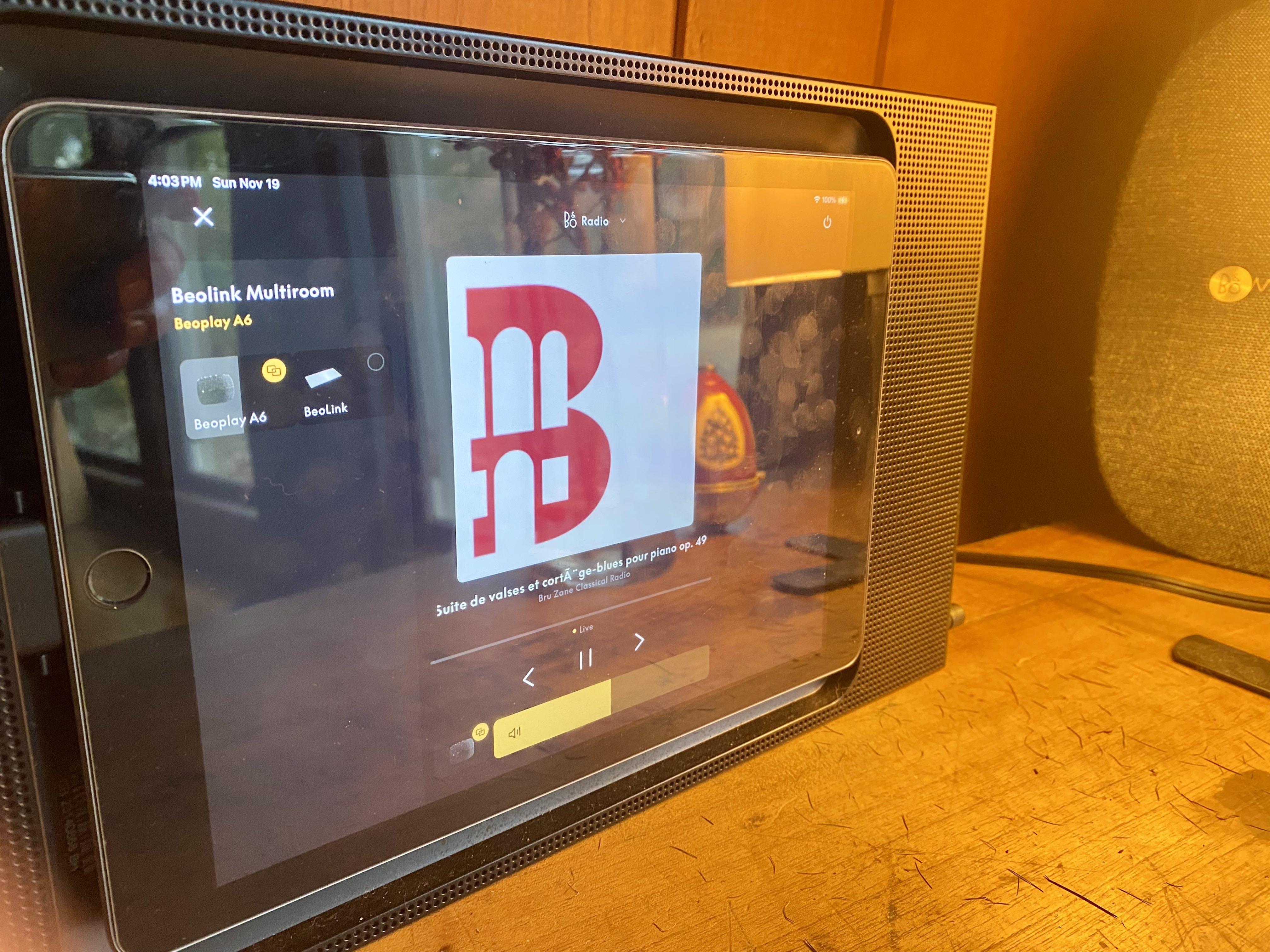
IR Eye:
The IR Eye, using decades-old tech, knows we are in a Multiroom situation, and happily plays the B&O Radio content, having Joined-In.
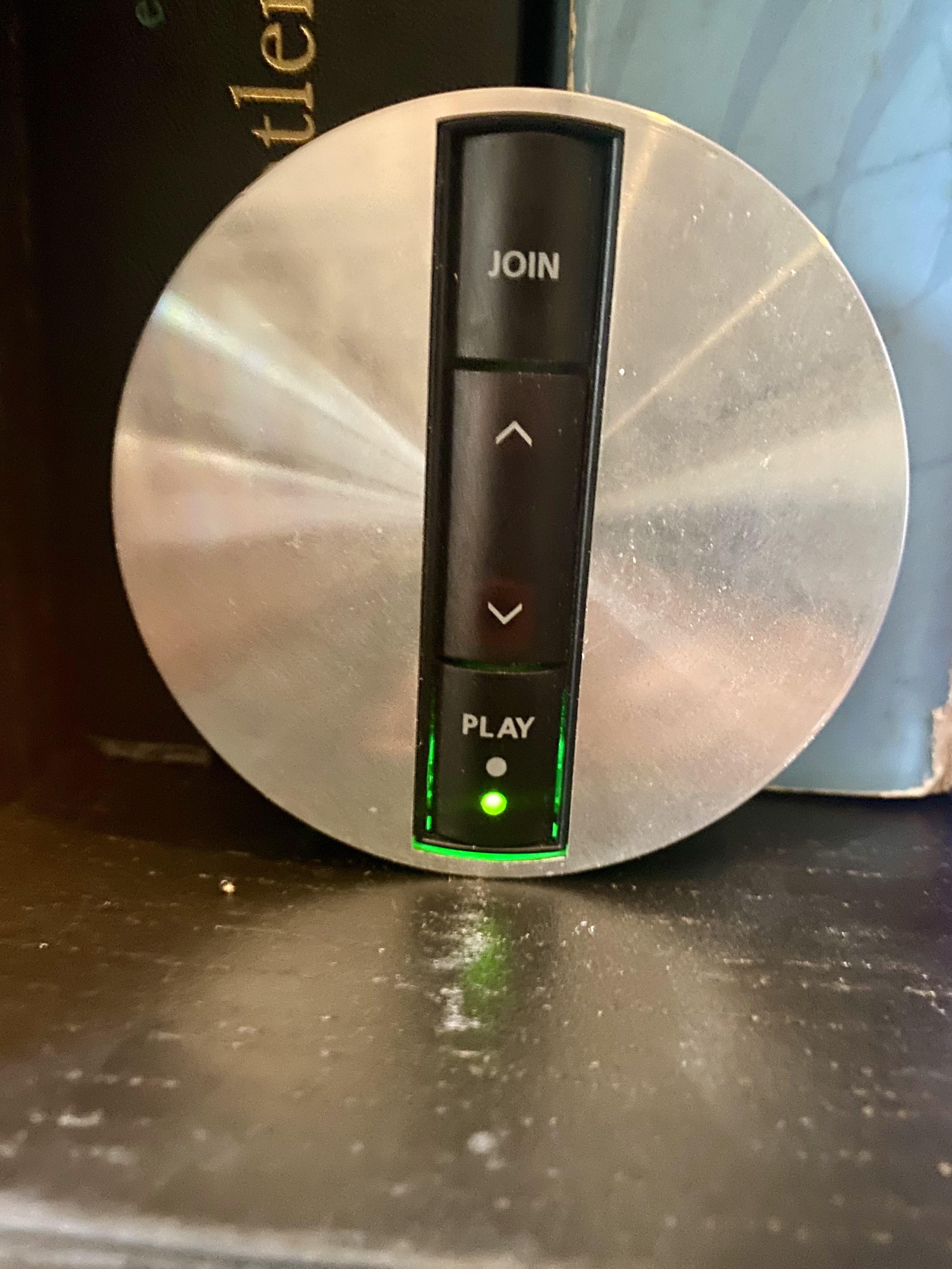
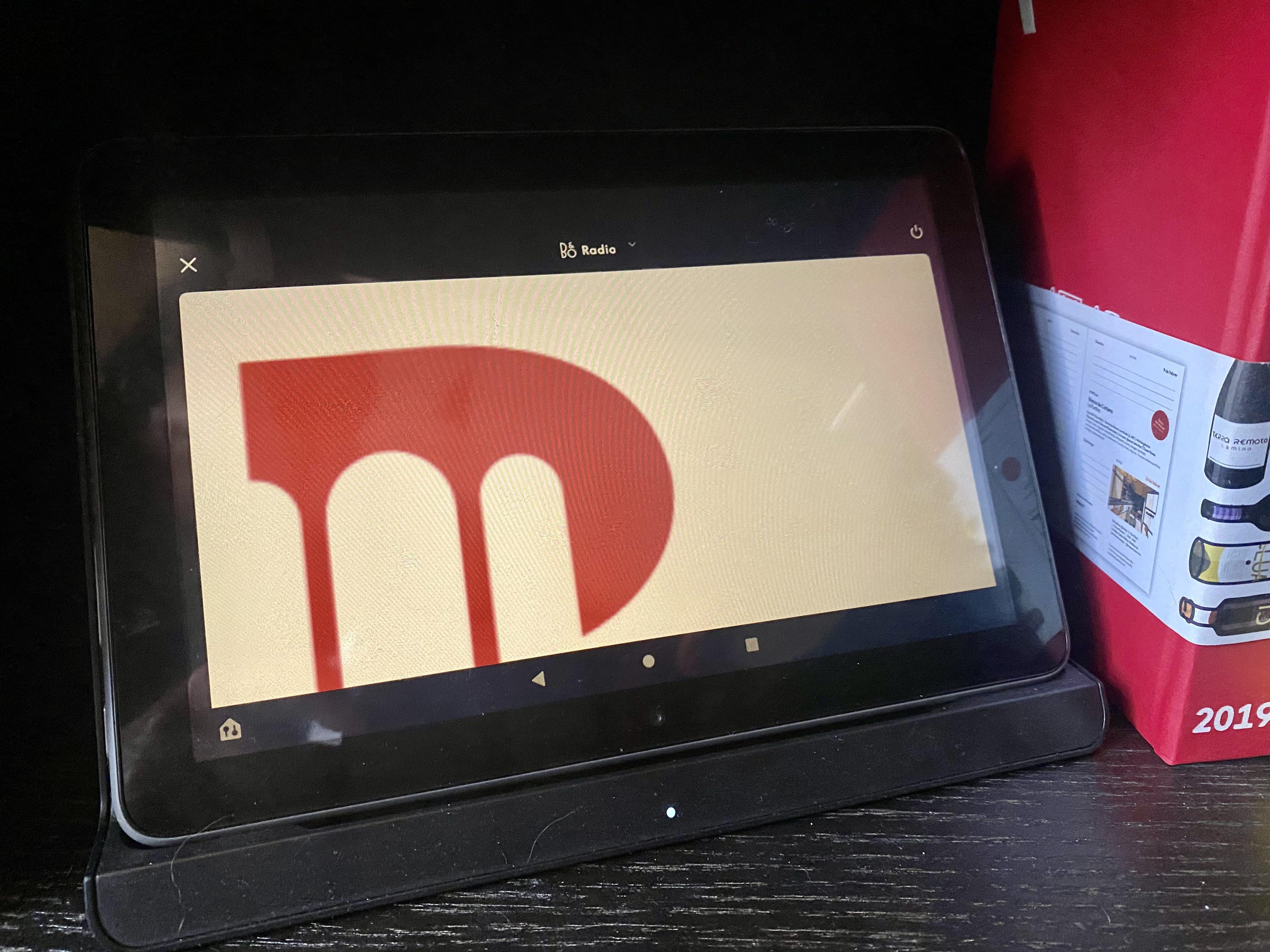
Fire Tablet (Amazon’s version of Android):
Utter and complete disaster. Can’t see what’s playing, other than “B&O Radio”. No pause, volume, nor switch controls. No multiroom controls.
 November 20, 2023 at 8:30 am #26368
Stephen, I’ve sent you a message with an invite etc., and small explainer. Let me know if you have any q’s.
Got it, thanks Sandy
November 20, 2023 at 8:32 am #26369Stephen, I’ve sent you a message with an invite etc., and small explainer. Let me know if you have any q’s.
Got it, thanks Sandy
November 20, 2023 at 8:42 am #26370p.s. I am interested in the App Feature Request thread in Discord mentioned by MM. How do I access that?
By the way….how do you (re)install the previous app versions on a Mac? I guess some of us might want to learn more about that. MM
Hi MM,
Thanks for letting me know about Sandy. He already sent me an invitation to Discord.
I haven’t installed any version of the app later than v5.3 on my Mac. I have been testing the beta versions on my iPhone and iPad. Given what a disaster these are, I am hesitant to install these on my Mac until there are significant improvements. The version in the App Store is 5.5.2. I might give it a try on the Mac since my biggest complaint was the disappearance of the play queue in 5.4, which is now back.
Incidentally, there is a Test Flight app available for Macs in the App Store but I haven’t downloaded that. I just use my iPhone as the testbed for the B&O app before updating the Mac. Or not!
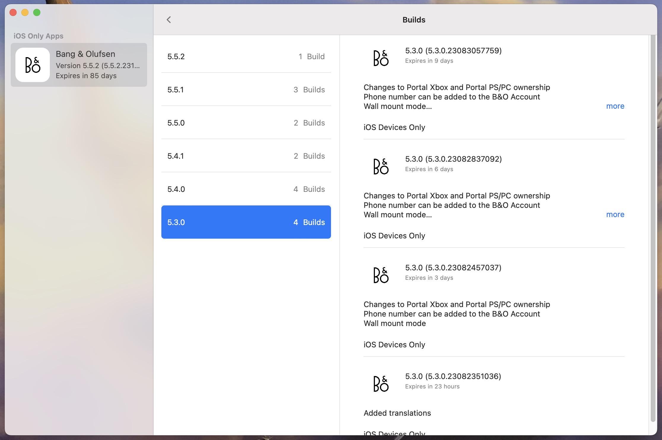
November 20, 2023 at 4:09 pm #26394Update to the message above. Test Flight for Mac shows the previous builds of the B&O app but it does not allow one to install any of them, including the most recent. It notes that the app is ‘for iOS devices only’. (See attachment,) Presumably , this is because the B&O app is not approved for Mac computers. I wish it was.
Stephen
 November 20, 2023 at 4:57 pm #26401
Hi Beoworlders,
Here is an open invitation link to the B&O Discord server, where members of the B&O development team are active so you can offer your feedback directly to them:-
It is also a vibrant B&O fan community and a great place to chat – I look forward to seeing you all there (as well as here on Beoworld of course!)
Kind regards, Steve.
November 20, 2023 at 5:26 pm #26409You can enter a Feature request – in the App Feature Request thread – in Discord. Mr.Anderson of the app dev team asked me to set up a section there (its under B&O Engagement), and there is a master list of outstanding feature requests there, for B&O to look at. While i imagine you have provided your feedback through other means, I only mention it to you as the B&O guys have a specific place on the Discord server where they check in and look at a collated list of feature requests. Anyway, just a passing thought.
I started this thread because I wanted to know what people think about the appearance of the different app versions from an aesthetic, visual point of view.
The quirks with the newest app version – what does not work etc – is another can of worms.
These issues should better be discussed in the long Beta thread here.
This thread was by no means meant to take over…I think it is fine that Mr Andersen and the app team is present on the Discord/B&O.
However, Mr Andersen used to be on Beoworld from time to time – and I guess the long app thread here could give some inspiration for the team.Personally I am more or less arrived at a point, where I think that this has no sense anymore – Mr Andersen and the team are doing their thing no matter what. I have yet to see how many of the ‘requests’ on the Discord/B&O have been taken serious.
Lately they seem take make changes in the app without telling people how to execute these…..according to Willy in the Beotalk show this sunday.My 5.3 beta version will soon expire and there is no way going around the new version, whether one likes the appearance or not.
So I will probably use the app less than before (unfortunately)……but I have my BROnes, which are my main control tools anyway.MM
- AuthorPosts
- You must be logged in to reply to this topic.
